
SCAD UX Design
Pursuing User Experience Design with foundation in Graphic Design. Building expertise in design theory and digital product design.
UX/UI designer with a Graphic Design foundation. I specialize in information architecture and high-fidelity prototyping—translating complex systems into intuitive digital experiences.
Explore my complete portfolio
Website redesign focused on improving usability, clarity, and discoverability.
View Case →UI design and prototyping for makeup company website.
View Case →Large-scale regulated financial industry project.
View Case →Smart home app redesign and prototyping.
View Case →Website redesign focused on usability and discoverability.
View Case →UI design and prototyping for makeup company website.
View Case →Large-scale regulated financial industry project.
View Case →Smart home app redesign and prototyping.
View Case →
I'm a passionate designer specializing in creating intuitive digital experiences. Currently pursuing User Experience Design at SCAD, I combine my background in Graphic Design with a deep understanding of user-centered design principles.
My approach focuses on rapid prototyping, thoughtful interactions, and creating designs that solve real problems. I believe great design is invisible — it just works.
When I'm not designing, you'll find me creating augmented reality art for museum installations, experimenting with new design tools, or collaborating with teams to bring innovative ideas to life.
My journey in design and technology
Pursuing User Experience Design with foundation in Graphic Design. Building expertise in design theory and digital product design.
Graduated with degree in Graphic Design. Established foundation in visual design, typography, and branding.
Created augmented reality installations for museums, combining traditional art with cutting-edge technology.
Team project redesigning a consumer brand website with focus on UI design and experience strategy.
Team project on large-scale regulated financial platform. Contributed to UX research, UI design, and prototyping.
Team project — led all prototyping for Nest app redesign, owning animations, transitions, and interaction specs.
Website Redesign — UX Case Study
Redesigned Kennickell Printing's website to fix a confusing information architecture and visual clutter that was causing users to abandon the site before placing orders.

Users consistently failed to locate core services and couldn't determine where to start an order. Navigation felt like a maze: important content existed but was buried under poor labeling and inconsistent hierarchy. The site's structure didn't reflect how customers actually think about print services.
Business impact: Confusion at the service-discovery stage meant prospective customers were leaving before contacting sales — directly affecting revenue.
We ran three-audience research: first-time visitors (5 participants), returning customers (3), and company employees (2). Methods combined task-based usability testing, card sorting to surface mental models, and observational navigation analysis with think-aloud protocol.
Key finding: 7 of 8 external participants couldn't locate the "Request a Quote" path without prompting.
The project was scoped to a website-builder platform with limited custom layout control, which meant we couldn't restructure templates — only the content within them. We also had to maintain brand colours and WCAG AA contrast compliance throughout.
10-week timeline required rapid iteration cycles with client check-ins at weeks 3, 6, and 9.
We ran parallel individual exploration (each designer took one page cluster), then converged in a critique session to combine the strongest ideas into a shared solution. The core fix was restructuring the IA around three clear user jobs: Browse services → Get a quote → Track an order.
Every navigation label was rewritten based on the language participants used during card-sort sessions — replacing internal jargon with task-oriented terms.
.png)
We delivered a fully functioning high-fidelity prototype accepted by the client at the final review with no major revision requests.
Makeup Company Website Redesign
Led all prototyping for a 3-person team redesigning the Philosophy brand website. Owned animations, transitions, and cross-team design consistency from first wireframe to final handoff.
As Lead Prototyper I owned the end-to-end prototyping process: building all Figma connections and interactions, defining the motion language (easing curves, durations, transition types), and reviewing teammates' screens to ensure visual and behavioral consistency before every client presentation.
I also contributed directly to layout decisions on the homepage, product detail pages, and checkout flow — not just wiring them up.
Advanced Figma interactive components and auto-animate, scroll-triggered overlays, micro-interaction design, and maintaining a shared component library across three concurrent designers.
Ran weekly prototype reviews with the team, wrote interaction specs for handoff, and fielded all prototype-related client questions directly — managing expectations around what was native-web-achievable vs. prototype-only.
Delivered on time within a compressed 5-week schedule. The client expressed satisfaction with the prototype fidelity and specifically called out the product-page transitions as a highlight.
Large-Scale Regulated Financial Design
My first experience embedded in a 20+ person design team on a regulated financial industry project. Wore multiple hats across research, UI design, and prototyping simultaneously.

Research: Conducted primary interviews and secondary literature review, joined client discovery sessions to capture domain-specific insights, and ran competitive analysis across 4 comparable fintech platforms.
Design & Prototyping: Created UI screens for 2 major feature areas, built interactive prototypes used in 3 client presentations, and produced motion graphics for the final deliverable deck.
With 20+ contributors, alignment was the hardest design problem. I attended cross-pod syncs twice weekly, followed shared naming conventions in Figma, and flagged inconsistencies between pods before they reached clients.
FINRA's compliance constraints shaped every design decision — plain language requirements, disclosure placement, and audit-trail considerations all informed UI choices in ways that pure product work rarely demands.
This project proved that speed of context-switching matters as much as craft. Moving from a research interview in the morning to a prototype review in the afternoon required sharp mental gear-shifts I hadn't developed in smaller team settings.
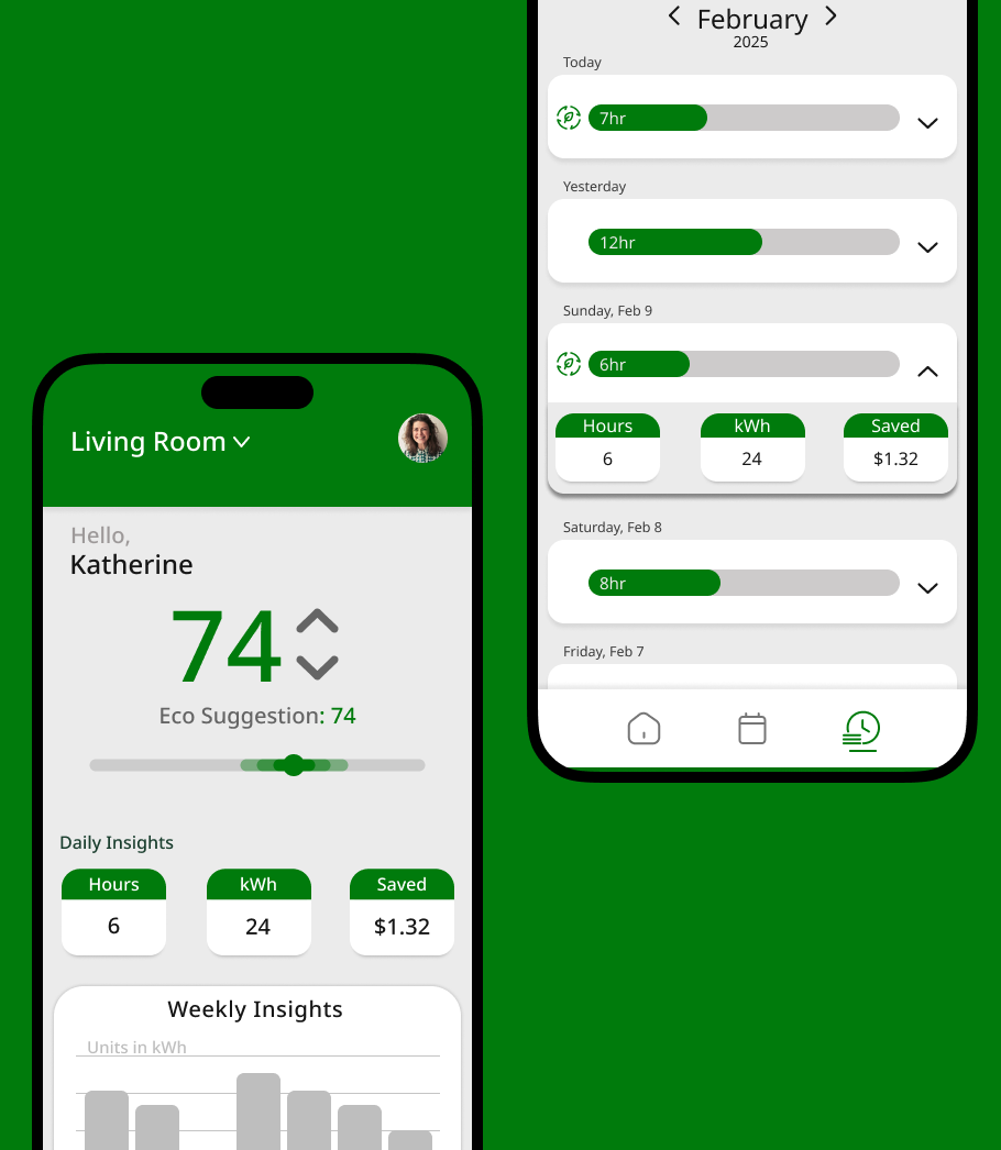
Smart Thermostat App Enhancement
Led all prototyping and owned UI design for the Settings and Home pages in a 7-person team redesign of the Nest mobile app. Focus was on reducing cognitive load and making everyday temperature control feel effortless.
We ran weekly syncs where each designer presented their screens for group critique, and I led a mid-project "prototype consistency" session to align animation durations and easing across all 7 contributors' screens before integration.
The team dynamic was notably effective — honest critique culture and clear ownership boundaries prevented the overlap and confusion that can bog down larger groups.
Defined the motion language for the entire app: spring physics for dial interactions, fade-slide for screen transitions, and haptic-analogous micro-animations for confirmations. Reviewed and rebuilt teammates' rough interactions to match spec.
Led UI design for Settings and Home screens — the two highest-traffic pages in the app. Contributed UX decisions on schedule management and energy history views. Created all wireframes for my pages before moving to high fidelity.
The project confirmed that prototyping is where I work best — the point where abstract design decisions become tangible and testable. It also revealed a gap in my motion toolkit that I've since addressed through dedicated study of animation principles.